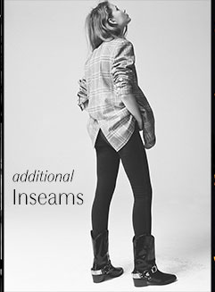
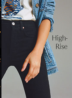
Free People - Category Toppers
Free People is an American bohemian apparel and lifestyle retail company that sells women's clothing, accessories, shoes, intimates, and swimwear worldwide. More than a clothing brand, Free People aims to create a lifestyle that’s inclusive and sincere.
Tasks
Analyzing User Research
UX/UI Design
Prototyping + Coding
Presenting to Stakeholders
Timeline
Fiscal Year 2019
Team
1 UX Designer and Front End Coder (me)
Analytics Team
BUSINESS OVERVIEW
In August FY2019, Free People distinguished itself as the top-performing brand within the URBN portfolio, achieving a significant increase in comparable Retail segment net sales (Market Chameleon). This success was propelled by a strategic emphasis on digital innovation and consumer-focused strategies, which marked a pivotal phase in Free People’s digital transformation. These efforts laid a robust foundation for sustained growth in an increasingly competitive retail landscape. Recognizing that this transformation was still in its early stages, the team remained committed to further refining its digital capabilities to sustain and expand its success.
THE CHALLENGE
As Free People’s digital presence gained prominence, senior leadership intensified their focus on the website, presenting both opportunities and challenges (Market Chameleon). The merchandising team prioritized creating a visually captivating site that embodied the brand’s aesthetic, while the digital marketing team was driven by the need to maintain purchase opportunities and ensure the site’s profitability. These contrasting goals often clashed, with design elements like “category toppers” becoming a key point of tension.
As a UX designer, my challenge was to balance the needs of both stakeholders, crafting a solution that would deliver the brand aesthetic while supporting the site’s business goals.
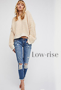
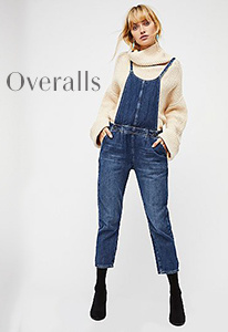
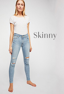
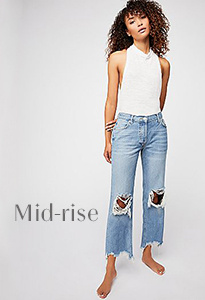
SAMPLE CATEGORY TOPPER
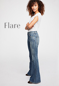
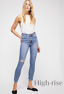
Category toppers—large imagery banners at the top of collection pages—were initially implemented to enhance the brand’s visual storytelling but lacked functionality and often pushed shoppable content further down the page. This led to a negative impact on key performance metrics, as customers had fewer immediate opportunities to engage with purchasable products.
PRELIMINARY RESEARCH
Research from the Baymard Institute underscores the importance of prominently displaying key content, such as shoppable products, to optimize user engagement and conversion rates. E-commerce sites that fail to prioritize usability in their product list design can experience abandonment rates as high as 90%, compared to just 17–33% on optimized platforms.
This insight highlights a key challenge: when products are pushed below the fold—such as by large imagery or non-functional design elements—customers are less likely to immediately engage with purchasable content. Above-the-fold visibility plays a crucial role in guiding users toward conversion pathways and preventing frustration. For Free People, this principle was particularly relevant when balancing the visual appeal of category toppers with the site’s need to showcase products promptly. Striking a balance between aesthetic elements and product placement is crucial to maintaining both brand identity and profitability (Baymard Institute, SEMrush).
Studies show that above-the-fold ad placements yield a 44% higher click-through rate than below-the-fold placements, underscoring the value of visibility for driving user actions (Chitika).
GOALS + EXPECTATIONS
The primary goal was to ensure that shoppable content and opportunities for the company to generate revenue consistently appeared above the fold on a customer’s screen. This focus aimed to prioritize functionality and accessibility, ensuring that customers could quickly and easily engage with products, driving conversions and supporting the company’s business objectives.
SOLUTION 1: Reducing the Height
The first solution I proposed was to reduce the height of the category toppers, addressing the challenge of shoppable content being pushed below the fold. Previously, toppers averaged a height of 520px, which consumed significant screen real estate and prevented customers from immediately seeing products upon landing on a page. By redesigning these toppers to an average height of 380px, the first line of products was brought above the fold, improving visibility and enhancing the customer’s shopping experience, as illustrated in the screenshot below.
Redesigned category toppers at 380px in height
SOLUTION 2: Adding functionality
The second solution that I proposed involved enhancing the functionality of category toppers by incorporating clear and strategic calls-to-action (CTAs). These CTAs were designed to guide customers directly to the products they were looking for, streamlining their shopping journey and increasing the likelihood of conversion. I did this in two ways:
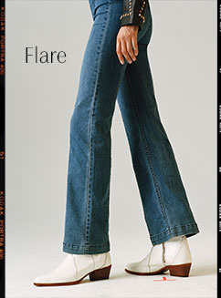
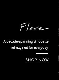
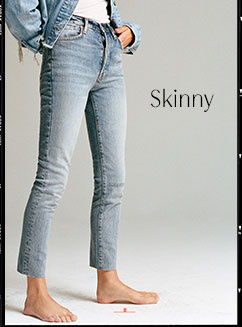
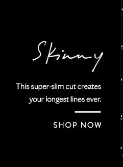
Single Toppers with Embedded CTAs: The first approach involved embedding one or more CTAs directly onto the existing topper design. This allowed customers to engage with featured categories or promotions immediately, providing a simple and effective path to shop.
2. Split Toppers with Multiple CTAs: The second approach divided the topper into 3-4 smaller, distinct images, each featuring its own CTA. This design offered more clear-cut options for navigation, as each image directly linked to the specific product or category it represented, simplifying the shopping experience.
SOLUTION 3: Compact and functional
My third solution combined the benefits of the first two approaches, focusing on making the toppers both shorter and more interactive to encourage user engagement. The goal was not only to improve functionality but also to make the toppers an inviting and integral part of the user journey.
Drawing inspiration from Google’s interactive homepage elements
WIREFRAMING WITH TECHNICAL CONSIDERATIONS
Before developing a full proposal for the team, I needed to confirm that the concept for an interactive topper could function within the limitations of our CMS, which did not support JavaScript. To do this, I first coded a simple wireframe using only HTML and CSS to test the feasibility of implementing hover-enabled CTAs and interactive elements.
Once I verified that the functionality could be achieved, I created low-fidelity mockups in Photoshop to visualize the design. These mockups allowed me to prototype the concept and ensure I had a clear and practical solution to present before moving forward with a more detailed explanation of the proposal.
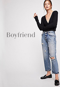
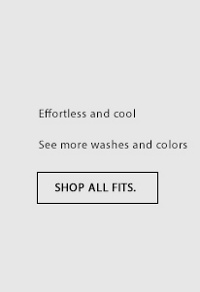
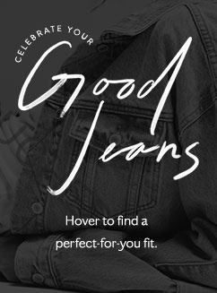
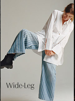
Hover over the examples to test the functionality and explore how the interactive elements work ↓
|
|
|
|
|
FINAL DESIGN
KEY DESIGN ADVANTAGES
Shoppable: Encourages customer productivity and engagement by seamlessly guiding users to relevant products, increasing the likelihood of conversion.
Keeps Products Above the Fold: Ensures shoppable content is immediately visible, enhancing accessibility and supporting business goals of driving revenue.
Customer Education: Provides valuable context about products and collections through interactive elements, helping customers make informed decisions.
Brand Differentiation: Elevates the site’s appeal with engaging, interactive web content that sets the brand apart from competitors.
TESTING
I conducted usability testing with a representative group of participants to validate my interactive topper design:
Total Participants: 16 lookalike customers
Demographics:
Women aged 18-35
Recent purchasers of denim within the last 12 months
Shopping Behavior:
Participants also shopped at competitor sites, including:
Levi’s
Madewell
American Eagle
TESTING CONTINUED
RESULTS
The 5up hover topper design consistently outperformed all other topper variations during testing. Key results included:
Impact on Jeans:
+6.9% increase in PDP views per session
+5% increase in dollar per session
+27% increase in jeans revenue from users who experienced this design
Impact on Dresses:
+4.8% lift in percentage of users reaching PDPs
+9.8% increase in the number of PDPs viewed
+0.7% lift in conversion rate (CVR)
RECOMMENDATION
Recommend rolling out the 5up hover topper design to 100% of shoppers and implementing it across all collection pages. This approach will maximize engagement, conversions, and revenue, building on the strong results observed during testing.
CONCLUSION
Building on the success of this redesign, we began utilizing the new topper layout in all other parts of the website, leveraging its functionality and engagement benefits across various campaigns. where we not only incorporated the topper at the top of the collection pages but also began adding a version of it to the bottoms of product detail pages. This expansion showcased the versatility of the design and its ability to drive engagement at multiple touchpoints.
LOOKING AHEAD
Looking to the future, the next step could involve personalizing toppers for individual customers. By tailoring these elements to reflect user preferences and shopping behavior, we can further enhance engagement and create a more meaningful and customized shopping experience. This evolution would align with the brand’s commitment to both innovation and customer-centric design.


